In 2000, I began making drawings where the arrangement of dots in Braille created the image. (Some one on my website, here.) These were - at first - made through a complex process of applying ink to the back of sheets of absorbent rice paper and allowing it to pass through the paper. I often chose passages from books in which authors tried to describe the effects of color as my source material. I was very fond of Frank O'Hara's poetry, and his poem Why I Am Not a Painter is one I used over an over again...
I am always interested in other artists who work with similar ideas, so I was fascinated a when, last week, I heard about Jaz Parkinson's work on Smithsonian.com (another story recently appeared on the Wired website).
| Jaz Parkinson, The Red Badge of Courage |
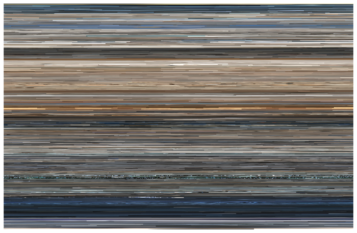 |
Jason Savalon, The Top Grossing Film of All Time, 1 x 1 2000
Digital C-print mounted to Plexiglas.
|
What I liked about Savalon's work was that it was constructed out of the act of reading and analyzing the film that it took as its subject. Its ultimate form was determined by its subject - and that is consonant with what I have tried to do when I consider writing in my work...
In 2011, I began to work with James McBride's memoir, The Color of Water. I was struck by how a book in which the role of color in establishing identity used reverence to color in the writing. I was also reminded of a news story I'd read about an oceanographer who was using the color seen in satellite images to determine the health of the seas. It seems to me necessary to cross these two ideas - that neither one would be sufficient.
I began reading McBride book for just its references to color and produced an edited version which consisted of only the names of hues

and translated that list of colors into Braille, substituting one dot for each pixel in a satellite photo of the sea. I wanted the resultin image to be large, overwhelming, so I printed it digitally and framed the 32 separate pages of the resulting image in narrow whote frames, that created a kind of window-pane through which one looked at the image...
 |
| Gerard Brown, The Color of Water (after James McBride), 2011, digital print on 32 sheets, 88 x 68 inches total |
The fundamental question that animates my work has long been, how much can something be changed without losing its identity? Is it still a text when it's translated into Braille? Sure. How about if that Braille is flat and large? Well, maybe. What if each of the six dots in the Braille letter is a different value, determined by another kind of text (a photograph) related to the first text? Now we're starting to cross a line from translation into transfiguration...
No comments:
Post a Comment