Monday, December 31, 2012

Studio wall


Having trouble getting images on my webpage's sketchbook, so I wanted to share this here....still sorting out the studio to some extent, but getting work done a little at a time...these are transcriptions of passages from the readings I assigned my students this fall, or things I found while I was researching the Intro to Visual Studies class.

Saturday, December 29, 2012

Yet more graphic violence...

Some time ago, I notices that hazard signs had become more specific about the consequences of misuse or ignoring warnings...I wonder if this is response to some kind of lull brought on by less explicit signs. Here are a few examples of rather specific hazard signs...


Friday, December 28, 2012

More graphic violence


from the Retronaut...do they have a category for gruesome deaths?

Friday, December 21, 2012

Today's news - Kraftwerk Victorious

Could the Economist have found a more dire photo? Oh right, this is Kraftwerk,,,
So it seems that the German courts have gone where few dare tread and ruled on a case that involves sampling and appropriation. According to a December 18  post on the Economist's website:

Like all of these sorts of things, the narrative is tricky. It seems that in a 1977 song, Kraftwerk created a sound in a song called Metall Auf Metall that caught the ears of producers Moses Pelham and Martin Haas, who used it in a 19997 song called Nur Mir. This being the latter quarter of the 20th century, Kraftwerk sued. The case has been working its way through the German courts for a dozen years, and finally the German Supreme Court ruled in favor of Kraftwerk, saying (in the words of the Economist):

The question at the heart of the case is how far sampling the work of other artists—a mainstay of modern hip-hop and techno—is permissible when creating new music. The answer given by the Supreme Court is that it is only permissible if the same effect could not have been produced by the new artist himself. After various demonstrations by expert witnesses, crashing metal on metal and using instruments such as a 1996 Akai Sampler, it was shown that an imitation of the sound-bite would have been possible in 1997.
So, if I understand this correctly, the decision has to do with what is technologically possible, not what the use of another recording might mean. This a bit of a bummer for those of us who are hoping for a more open culture and less choking control on those things that are already in the world.

One remediates (my new word for using another's images, words or sound in another work) often because one wants to be in conversation with the original work - not just because it sounds cool. The whole point is for readers, viewers, or listeners to recognize other's voices as an integral part of making your own voice. We are, all of us, patched together from borrowed pieces of codes, little snippets of other's identities that surface from time to time. Trying to control that is like trying to stop the tide from coming in...it's not a question of what a machine can do, but what a person needs to do something...

Thursday, December 20, 2012

Writing makes worlds


Super interested in Joshua Foer's New Yorker article on article on Ithkuil inventer John Quijada. Like all New Yorker articles, it's a two day investment for me these days, but found a lot to groove on in the first section, which gave an overview of invented languages and seemed like a complement to Joanna Drucker's Alphabetic Labyrinth, which I have been struggling with for about a month. Most interesting me - because it connects up to some work that's going on in the studio - is the reference to ideas put forward by Descartes and Leibnitz (which I am still trying to wrap my head around) that suggest numbers may be a more precise mens of constructing written language than phonetically-driven formula we use. 

The use of numbers to replace words may have first come to my attention with the CD 10-codes of the 1970s (I remember a plastic trash bag you were supposed to hang in the car that I insisted on memorizing because it had a list of these codes...and it should be immediately obvious that we had no CB radio in the family). But I remember Target getting some bad press for selling shirts that were emblazoned with an 88 some years back, and then I started to realize that written language might work a few different ways...

Anyway, looking forward to finishing this, and I'd be happy to hear from anyone who is a native Esperanto speaker or has other language issues to share...

Wednesday, December 19, 2012

Imagery


Loving the song Dumb Ways to Die, I was amused to find this image in a collection called 30 Ways to Die by Electrocution

New work

I often put images of things one the studio desktop on the sketchbook page of my website...and I'm nto sure why I am using this instead...but I am.

The book factory has had a slow start this year. I think it's the chaos of the new studio. But I am working...

small books getting done...
I have also been working on some new paintings...I hope to have some images of them to post soon, but here is a small piece I made for a fundraiser that I think might suggest where things are going...

We/You/I See...gouache on paper, 10 x 8 in.

Monday, December 17, 2012

Sing along


KCRW playing a cover of this song with Aimee Mann...which is nice, but this is such a pleasure as is...

Changing direction

Bridget Riley, Squares in Motion, 1961

I have decided to close my Facebook account for the time being. I have noticed a number of things that bother me about interacting with Facebook that I want time to sort out. I will miss the easy connection to family and friends that the application provides, but I will try to keep up through letters, email and phone calls.

Another thing I will miss is just sharing interesting news reports and images that come across my field of vision, so I will use this forum for re-posting them.

Here's an interesting story from the Pacific Standard that reports that we respond to visible stimuli - starkly contrasting patterns shown to test subjects led to more decisive behaviors. I expect I will be painting my office a number of shades of grey...

Monday, October 29, 2012

Some disasters...

from "The Day After Tomorrow"

from the same film...New York really gets it in these films...

last one...

from the 2007 film "Flood"

and another 'Flood' image

London deluged in 'Flood'...nothing for Philly...


Wednesday, September 19, 2012

:-)

"When an interviewer asked Nabokov how he ranked himself among great writers, [...] the writer replied, ''I often think there should exist a special typographical sign for a smile -- some sort of concave mark, a supine round bracket, which I would now like to trace in reply to your question.''


TYPOGRAPHIC MILESTONES; Happy Birthday :-) to You: A Smiley Face Turns 20
By Katie Hafner
New York Times September 19, 2002

Monday, September 17, 2012

Class prep


...thought I would show a video of Marshall McLuhan to my Visual Studies class today (after all, the medium is the...well, you know the rest...)

This one didn't make the cut, but it sure is good...

Saturday, September 08, 2012

Thursday, August 16, 2012

Sinister decorating ideas...

I have a new favorite toy online...Chip it! by Sherwin Williams helps you select the right paint colors for your new decor. You simply give it the URL of a picture you like (you can even up load a picture!) and it helpfully returns the Sherwin WIlliams products that make up that picture.

I plan to update this with a number of notable images, and invite your suggestions....

Francis Bacon would choose a color called 'mesmerize'...

Very manly palette in this Robert Capa photo...

Mmmm...'toasty'

I've always been a huge fan of Philadelphia artist Judith Schaechter, too...

Saturday, August 11, 2012

Summer homework

This summer, an artist I know came up with a project in which a number of people shot photos using disposable cameras and sent the unprocessed images to one another. I pre-visualized mine with a digital camera...I am looking forward to seeing what the disposable camera got, but wanted to share the project's images here...


Thursday, June 14, 2012

Three-Letter Literature


A few days ago, using Facebook, I sent out an appeal for three letter texts I could use in the work I'm now making in the studio (an example is above...). This blog entry got me thinking. I wanted to anthologize the responses, and I need to make good on my promise of drawings for the contributors...keep an eye peeled for those...more contributions welcome!

Jeff Buddle:
"Ode"
Why not try?
Who can say?
The old man?
Fie! Let him
rot. Try now!

Tony Bures:
You may ask who led who?
How did bee and owl die?
Why the red sky?
The air run out and our pen now dry?

Kristan Campbell:
may eye
one fly
the one
not yet
you die
our fix
not let
you cry
the mix
lip fun
can dye
our ash
can run
the sky

Emily Cobb:
Bee not sad
Sis, wee fly
Fox our day
Bat the sky!
Eye per owl,
Rat out foe,
Lie, jaw, yak,
Ilk nor doe.
Matthew Parrish:
"Out"

Hmm, hum, aha!
Sip rum and see the sun
set sky. Dry off,
pet the dog, toe tap,
hit the bed,
end the day,
her age.

Cecilia Snyder:
Cat has fun fur and
will let you tug and pet him
now rub his shy tum

Sunday, June 10, 2012

The Abstract Engine


It must have been a slow news week because the Wall Street Journal gave over space to Terry Teachout for an essay on "The Seductive Lure of Abstraction.”

Teachout takes the occasion of a travelling exhibit of Richard Diebenkorn paintings as an opportunity to muse on why people care about abstraction in the first place. This may be a question that still stumps readers of the Wall Street Journal, and as much as I admire Teachout for trying to answer it, I found his response a little tired. He couldn’t stick to the problem at hand, often wondering away from the subject of painting to dance and music – as if imagery and narrative were really the same thing. Let’s take another go.

Richard Diebenkorn, Yellow Porch, 1961, oil on canvas,70 1/2 x 67 in.
Anyone who looks at a 60’s Diebenkorn ‘landscape’ and a mid-70’s ‘abstraction’ like one of the Ocean Park paintings will immediately recognize how fragile the wall that separates the real form the abstract can be. Why is abstraction framed as ‘seductive,’ as if to succumb to it is to be, in some way, unfaithful to representation?


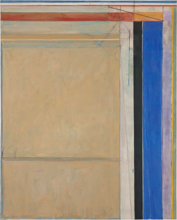
Richard Diebenkorn, Ocean Park #83, 1975. Oil on Canvas, 100 X 81 in.
Corcoran Gallery of Art, Washington, DC.
Realism as we know it didn’t exist until the mid-19th century when certain artists started to portray subjects familiar to the growing middle class and to cater to that audience’s interests (which often included a voyeuristic interest in poverty and hard circumstance)…things that seemed ‘real’. Compared to what? To the religious and historic subjects supported by the patronage class of the late 18th century, of course. Concurrently, many artists of the late 19th and early 20th century were drawn to abstraction by growing certainty that painting could be like music – that it didn’t need to refer to stories to be moving, that it could be beautiful based on its own formal properties. The fact that such views constituted a shift from the previous generation – a means of making two generations distinct from one another and thus creating a new market where none had existed before – seems like something no one wants to address. One sometimes wonders if the imperative to ‘make it new’ wasn’t really motivated by a horror of being seen as old…

But painting has – even when it carried water for its political or religious sponsors – always been driven by an abstract engine. One need only think of the legendary battles of skill between ancient Greek artists over who could paint the thinnest line. Or of Leonardo’s advice to seek the landscape imagery in stains and shadows on the wall. A hundred examples could be offered, and I invite you to add yours to the comments.

An artist like Richard Diebenkorn (or, for that matter, his mirror image Philip Guston) who slides across some perceived barrier between real and abstract ought to remind us of how entwined those things are – how artificial our ideas of reality actually are and how abstract the world actually is.

What makes Diebenkorn’s paintings worth talking about is their quality of specificity – of being so certainly about something that words seem to fail. (Teachout takes up the wordless defense that is so tired…artists are always saying that their works are outside of language. Such artsits should read more to see what people who use language can do with it…there’s a difference between something being beyond words and being beyond my words...) In Diebenkorn’s pictures, that sense of specificity comes in part from the way the artist reveals the process of making the picture. One sees lines drawn and drawn out, colors scumbled over colors, as if each decision were being made and then questioned. As if something had been seen and then recognized as mistaken…the pictures depict a world of second- and third-guesses.

When I go to see Diebenkorn’s Ocean Park paintings at the Corcoran, it won’t be to cast a vote for the real or the abstract. I will go because the paintings show me how false such a division is, and how much of the world they allow me to see.